Now over 2 years the Storybook Component Team hit so many WCAG goals, but this one slipped through the cracks.
The absolute best part of shifting into an AI-assisted Design Engineer workflow is that I finally have the bandwidth—and the code-level access—to go back and fix that technical debt myself.
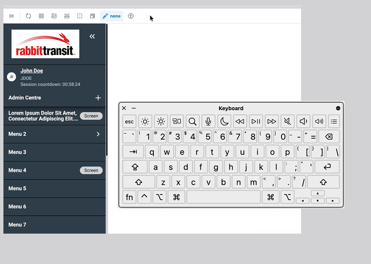
Using Kiro alongside Claude Opus 4.6, I recently jumped back into our Angular component library at AssetWorks to completely re-architect our side navigation. Here is a deep dive into how we moved from a painful tabbing marathon to a seamless, accessible experience using the W3C WAI-ARIA Roving Tabindex pattern.
The Problem: The Tabbing Trap
Previously, every single menu item in our side nav had tabindex="0". For a mouse user, this makes no difference. But for a keyboard user, it meant they were trapped. They had to tab through every single parent and child link just to reach the main content of the application.
The Solution: One Keystroke In, One Keystroke Out
The WAI-ARIA Roving Tabindex pattern solves this by managing focus programmatically. Now, only one item has tabindex="0" at a time (usually the currently active or first item). The rest are set to tabindex="-1".
- Enter: The user presses Tab once to enter the navigation.
- Navigate: They use Arrow Up/Down to move between items, and Home/End to jump to the first or last item. Submenus dynamically update the navigation list when expanded or collapsed.
- Exit: The user presses Tab again to instantly jump out of the nav and into the page content.
The Under-the-Hood Details
Fixing the tabindex was the primary goal, but proper accessibility requires context. We updated the component code to include:
- Focus Management: Ensuring focus follows the scroll through long menus, specifically accounting for our sticky headers.
- ARIA Roles: Implementing proper role="menu", role="menuitem", aria-haspopup, and aria-expanded attributes so screen readers announce the structure and state correctly.
- Hiding Decorative Elements: Ensuring decorative UI elements, like profile icons and SVG logos, are hidden from assistive tech using aria-hidden="true" to reduce noise.
Documenting for the Future
Fixing the code is only half the battle. If other developers don't know how to use the accessible component, the technical debt just returns.
We documented all of this directly in Storybook. Right alongside the visual states, we included keyboard navigation guides, key binding tables, and ARIA role references. When the next developer pulls this component, they don't just see what it looks like. They see exactly how it behaves for everyone.
Accessibility isn't just a compliance checklist to bolt on at the end of a sprint; it's a fundamental design decision that needs to be made at the component level. By leveraging AI to accelerate the heavy lifting, we can finally ensure those decisions make it into the final codebase.
This version acts as a fantastic mini case-study for your new portfolio. It proves you understand Angular, Storybook, and WCAG standards at a highly technical level.
Side Navigation with new WCAG accessible feature