THE DESIGN ENGINEER LOOP
I initially attempted to build this overhaul directly in code, but I quickly returned to Figma. I needed that dedicated sketch area for deep thinking—trying out numerous aesthetics and exploring color tokens, like balancing the exact forest greens of the cutting mat against the stark whites of the paper, until I landed on the perfect visual direction. Only then did I return to the codebase, leveraging the Figma MCP to seamlessly translate those finalized concepts into my development environment.
The Challenge:
The original application functioned mathematically, accurately mapping digital layouts to 8.5x11 physical paper, but the interface felt like a sterile software utility. The primary challenge was executing a massive aesthetic shift toward a tactile, "drafting table" environment without breaking the strict canvas math required for WYSIWYG printing, all while transitioning the front-end to a modern, fully responsive experience.
A TACTILE, CRAFT-DRIVEN AESTHETIC
The visual refresh completely replaces generic UI panels with an immersive, soft-minimalist crafting environment.
A human-led overhaul, using AI to finalize front-end enhancements.
Drag the slider to compare the transformation
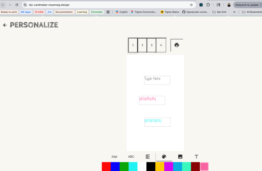
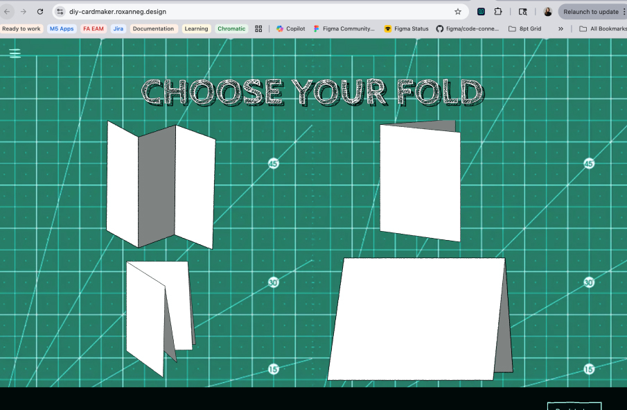
To ground the user in a crafter's mindset, I mapped the workspace to a forest green cutting mat. I also created and integrated custom, hand-drawn SVG blueprints for the core templates (including the Trifold, Bifold Vertical, and Quarter-Fold) to reinforce the DIY nature of the tool.
Throughout the build, I utilized AI coding assistants not to automate the creative direction, but as a collaborative tool to rapidly finalize UI tickets, generate complex CSS grid layouts, and ensure strict responsive logic for mobile viewports.
REFINING THE INTERACTION HIERARCHY
The Problem with "Everything Everywhere":
In the legacy application, the workspace suffered from severe cognitive overload. Every single tool, setting, and formatting option was displayed on the screen simultaneously. While a user could eventually navigate the clutter and figure it out, the lack of visual prioritization made the interface feel overwhelming and the design process disjointed.
Visualizing the UX Hierarchy Overhaul
Implementing Progressive Disclosure:
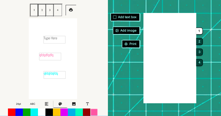
To fix this, I completely overhauled the UX of the interactions by establishing a strict, logical hierarchy of actions. I redesigned the tool palette to start with a clear, primary decision: Add Text or Add Image.
Contextual Tooling:
Once a user makes that primary choice, the UI dynamically responds. If they select text, the interface conditionally reveals only the relevant secondary choices—color, alignment, and font selection. By hiding irrelevant UI components until they are actively needed, the digital "drafting table" remains clean and focused. This drastically reduces user friction and transforms a confusing interface into an intuitive, step-by-step crafting experience.
BRIDGING DIGITAL TO PHYSICAL
The user journey does not end when they hit the "Print" button—a flat piece of paper isn't a card until it is correctly folded.
To close the cognitive gap between the 2D screen and the 3D physical object, I engineered a contextual Post-Print Modal. Instead of cluttering the workspace with static help menus, this modal intercepts the user the moment the print dialog closes, delivering rotoscoped, cartoonized video tutorials of the specific fold they chose exactly when they need to assemble it.
A NEW COLLABORATIVE PARADIGM
The Frustration of the Handoff:
Five years ago, attempting to execute a vision like this often ended in friction. I would sketch out the ideal user experience, only to hit the realities of traditional handoffs: developers lacking the time to execute pixel-perfect CSS, a disconnect in understanding the UX goals, or limitations in specific front-end aesthetic skills. The vision would frequently get lost in translation.
The Breakthrough:
Today, that paradigm has shifted entirely. Utilizing Claude, I was able to dive directly into this legacy Vue application and execute the UI overhaul myself. The ability to act as the front-end engineer—taking absolute control of the interface and independently translating my exact aesthetic vision into production-ready code—is nothing short of amazing.
Elevating the Partnership:
This workflow doesn't replace the need for brilliant developers; it actually elevates the partnership. While I drove the UX and front-end code, I was meticulously careful to preserve the heavy lifting done by my developer partner (who still hosts the live app). The complex architecture and the rigorous mathematical logic required to calculate aspect ratios for perfect WYSIWYG printing remained untouched. My developer partner still reviews my Pull Requests and drives the core systems, but now, I can fully own the final user experience without compromise.