FORENSIC UX AUDIT
The existing Asset Management Admin Portal was a labyrinth of legacy decisions. Workflows were circular, navigation was hidden in deep sub-menus, and the system was completely unusable on mobile devices.
The Analysis:
Before drawing a single pixel, I mapped the existing "spaghetti workflows" (as seen in the diagram). I identified critical redundancy where users had to click 5 times to access metrics that should have been visible immediately.
Heuristic Evaluation:
Identified high cognitive load areas.
Usage Metrics:
Surveyed admins to find the "Top 5" features buried in the old UI.
Forensic UX Audit: Mapping Legacy Workflows
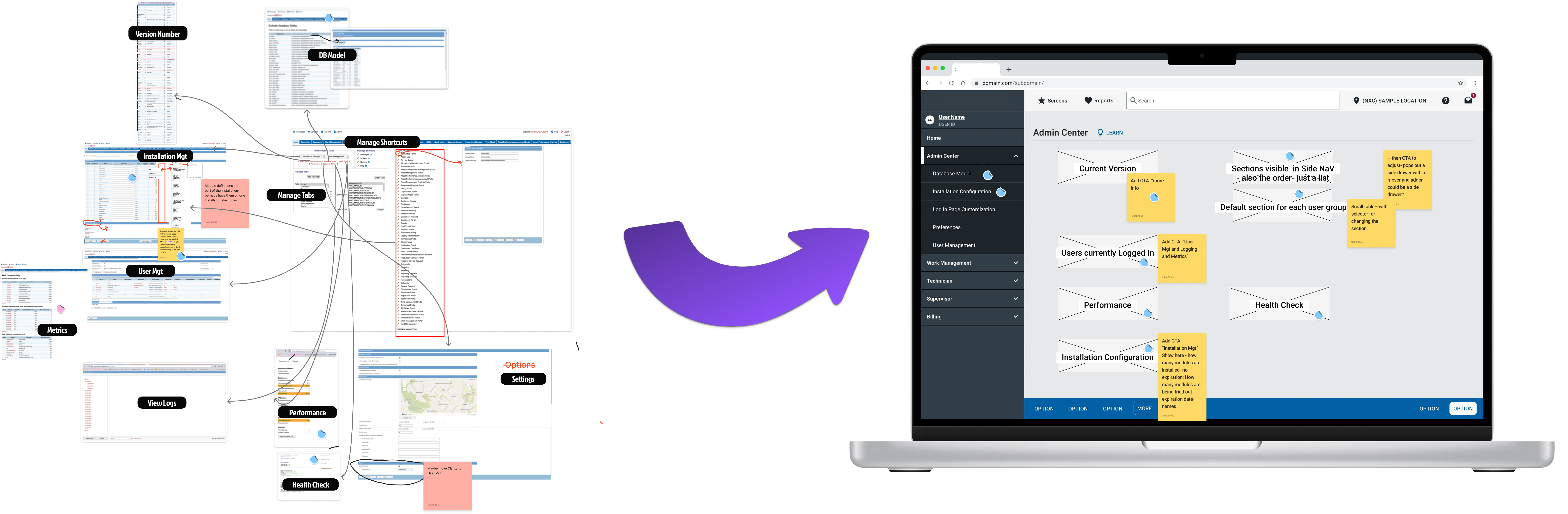
The forensic audit revealed a system where critical user paths were buried under layers of legacy navigation. The diagram illustrates the circular workflows and hidden navigation patterns that made the system difficult to use, especially for mobile users who needed quick access to key metrics.
Before and After
Drag the slider to compare the transformation
This transformation was directly informed by user-driven research. A basic dashboard pattern was employed which is a common interface for modern users. This aligns with UX principles—like Jakob's Law, which states that users spend most of their time on other sites, and they prefer your site to work the same way as all the other sites they already know. Adhering to these established patterns helps reduce cognitive load, making interfaces more intuitive and efficient to use.
Data-Driven Dashboard Architecture: Card Sorting with 19 Admin Users
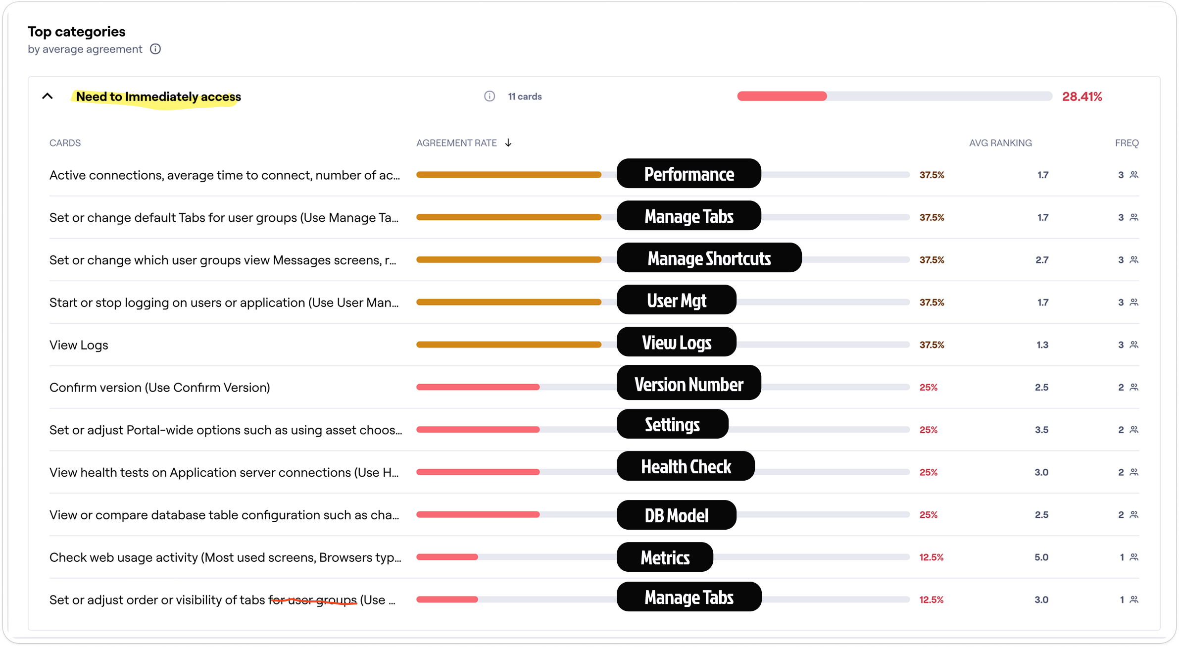
I conducted card sorting exercises with 19 admin users to determine the actual functionality that should appear at the top level of the dashboard. This quantitative user research directly informed the dashboard architecture you see in the before/after comparison above, ensuring the new design prioritized features based on real user needs rather than assumptions.
MODULAR ARCHITECTURE & CUSTOMIZATION
We didn't just "skin" the UI; we fundamentally changed the interaction model.
From Rigid Tabs to Flexible Layouts:
The legacy tab-based container system was outdated and completely incompatible with mobile responsiveness. I replaced it with a modern, card-based layout pattern that aligns with contemporary web standards—making the interface immediately familiar to users.
Drag-and-Drop Personalization:
Beyond just visual modernization, I introduced a drag-and-drop interaction model. This allows Admins to rearrange software modules to fit specific workflows with much greater ease.
Before and After: Legacy Tabs vs Modular Sections
The transformation from old school arrow clicks to drag and drop fundamentally changed how content is organized for end users by admins. The new architecture provides ease of use and ensures only appropriate modules can be placed into appropriate content containers.
Through stakeholder presentations demonstrating responsive behavior, I identified a critical UX issue: on smaller viewports, the left mini pane content would push primary content below the fold. By presenting this in a prototype, I secured Product agreement to retire the left pane concept entirely, ensuring that responsive layouts always prioritize main user workflows over secondary information.
SETTINGS REFACTOR: 40 YEARS OF DEBT
I tackled the consolidation of a Technician Module settings area that had accumulated 40 years of legacy configuration debt.
Forensic Audit:
I led workshops with Engineering and Product to identify and deprecate obsolete settings that were no longer in use.
Stakeholder Collaboration: Defining User-Centric IA

I facilitated collaborative workshops with stakeholders to understand how users actually think about and access their settings. These meetings also allowed deprecated settings to be identified and removed, streamlining the configuration options. This user-centric approach ensured the new Information Architecture would align with real-world workflows rather than technical system structures.
AI-Powered IA Analysis: Leveraging LLM for Structure
I leveraged AI to analyze and restructure the Information Architecture, using LLM capabilities to process the existing settings structure and group configurations into intuitive, user-centric categories. This AI-assisted approach transformed a chaotic legacy structure into an organized, discoverable system that aligns with how users actually think about their settings.
Standardization: Before and After
I applied a proven, responsive settings pattern used in two other modules, introducing helper text to clarify complex technical inputs while ensuring a consistent experience across the suite. This standardization reduces cognitive load and training time, as users familiar with one module can immediately navigate settings in another.
THE ROI OF MODERNIZATION
The modernization effort delivered measurable improvements in efficiency and accessibility.
50% Reduction in clicks:
50% Reduction in clicks to access key Admin metrics.
Zero Training required:
Zero Training required for existing users to adopt the new navigation.
Mobile Enabled:
Mobile Enabled: Admins on the go can now access admin features from mobile devices.