When you launch a project with a developer partner, there is usually a clear dividing line: the designer dreams it up, and the developer builds it. Five years ago, when we launched the DIY Cardmaker, that line was firmly in place.
The application itself is a marvel of underlying logic. It requires rigorous mathematical calculations to accurately map a digital layout to an 8.5x11 physical piece of paper so it prints perfectly. My developer partner absolutely nailed that architecture.
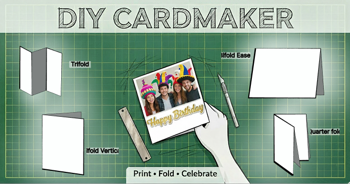
But the UI was a different story. From the very beginning, I had this vision of making the entire experience feel hand-drawn and tactile—like a real drafting table. The problem? I just couldn't get that vision organized or articulate it clearly enough to hand it off. Without a way to effectively translate that aesthetic into developer tickets, the interface defaulted to a sterile software utility rather than the creative sandbox I had imagined.
I still wanted that tactile environment. I wanted to fix the cognitive overload. But traditional handoffs are frustrating, and translating highly specific aesthetic visions often results in compromises.
So, I decided to pull this legacy Vue app down and do the front-end overhaul myself.
The Workflow: Figma First, Code Second
There is a misconception right now that AI is just automating everything. That's not how this works. This was a strictly human-led process.
Before writing a single line of logic, I went straight to Figma. Even when building in code, I still require Figma for sketching, deep thinking, and exploring color tokens. I needed to balance the exact forest greens of our new "cutting mat" background against the stark white of the digital paper until the visual direction was perfect.
Once the design was locked, I moved to the codebase. I did the AI chatting, utilizing Claude to seamlessly translate those finalized concepts into my development environment. I used AI to execute the heavy lifting of complex CSS grid layouts and mobile responsive logic, allowing me to focus on the overall user experience.
Refining the Interaction Hierarchy
The legacy application suffered from "Everything Everywhere All At Once" syndrome. Every tool and setting was on the screen at the same time. You could figure it out, but something was definitely off.
I implemented a system of Progressive Disclosure. I completely redesigned the tool palette to start with a primary decision: Add Text or Add Image. If you select text, the interface conditionally reveals only the relevant secondary choices—color, alignment, and font selection. By hiding irrelevant UI components until they are actively needed, the digital workspace remains clean, focused, and intuitive.
Bridging the Digital and Physical Worlds
The biggest point of friction in print-at-home tools is the cognitive leap from the 2D screen to the 3D physical object. The journey doesn't end when the user is done designing.
To solve this, I engineered a contextual Post-Print Modal. Instead of a static "Help" menu, this modal intercepts the user the moment their PDF is generated. While providing a primary button to open their final layout in a new browser tab for printing, it simultaneously delivers rotoscoped, cartoonized video tutorials of their specific fold—precisely when they need to physically assemble the card.
A New Collaborative Paradigm
The ability to act as the front-end engineer—taking absolute control of the interface and independently translating my vision into production-ready code—has completely changed how I work.
Crucially, this doesn't replace the need for brilliant developers. The complex architecture and WYSIWYG math remain untouched, and my dev partner still reviews my Pull Requests. But it elevates our partnership. I can now fully own the presentation layer and the final user experience without compromise. And honestly? It feels amazing.
Want to take the new drafting table for a spin? 🛠️
You can try out the fully refreshed DIY Cardmaker right now at diy-cardmaker.roxanneg.design.
Try choosing a fold, uploading a photo, and hitting print to see the new folding tutorial modals in action. As with any major overhaul, there might still be a few ghosts in the machine—so if you stumble across a bug or something feels off, please use the "Submit a Bug" link in the footer. Your feedback is the best way to help me keep refining this experience!
#UXDesign #UI #FrontEnd #Figma #ClaudeAI #DesignToCode #TechCollaboration